



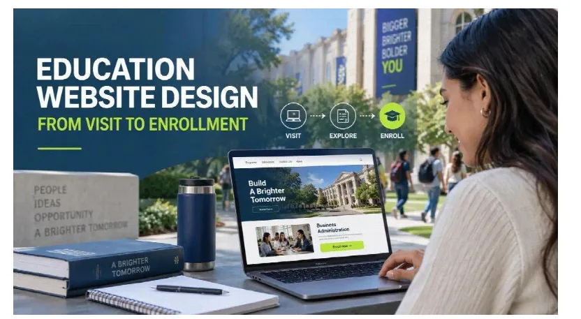
An education website has only a few seconds to answer an important question: “Is this the right place for me?”
Prospective students and parents rarely begin their search with complete confidence. They compare programs, tuition options, schedules, locations, outcomes, and admission requirements across multiple websites. If an institution’s website feels confusing, outdated, or difficult to navigate, visitors may leave before discovering what makes the school valuable.
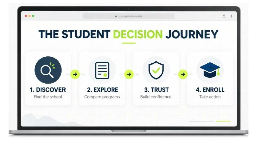
That is why modern education website design is no longer just about presenting information. A successful website must guide visitors from curiosity to confidence—and from confidence to action.
Start With the Student’s Decision, Not the Institution’s Structure
Many school and college websites are organized around internal departments. While that structure may make sense to administrators, it does not always reflect how prospective students search for information.
Visitors usually arrive with practical questions:
- What programs are available?
- How long does the program take?
- What will I learn?
- How much does it cost?
- Are financial aid options available?
- Can I attend evening or weekend classes?
- What careers could I pursue after graduation?
- How do I apply or request information?
The website should make these answers easy to find. Navigation labels such as “Programs,” “Admissions,” “Tuition,” “Student Support,” and “Request Information” are more useful than internal terminology that first-time visitors may not understand.
When a school is running a campaign for a particular course, campus, open house, or enrollment period, a focused landing page can perform better than sending traffic to a general homepage. Professional Landing Page Design Services can help institutions build pages around one audience, one message, and one clear conversion goal.
The essential principle is simple: organize the experience around what students need to decide, not around how the institution operates behind the scenes.
Make the Value Proposition Clear Above the Fold
The top section of an education website should immediately communicate what the institution offers and why a visitor should keep reading.
A vague headline such as “Build Your Future With Us” may sound positive, but it says little about the actual opportunity. A more effective headline combines the program, outcome, audience, or location.
For example:
Train for a Healthcare Career With Hands-On Classes in Los Angeles
A supporting paragraph can then provide the most important details, such as program length, available schedules, practical training, accreditation, campus location, or upcoming start dates.
The first screen should also contain a visible call to action. Depending on the institution and the visitor’s level of readiness, this could be:
- Request Information
- Explore Programs
- Schedule a Campus Tour
- Speak With Admissions
- Start Your Application
The goal is not to place every detail above the fold. It is to give visitors enough clarity and motivation to take the next step.
Create Dedicated Pages for Every Program
One of the most common education website mistakes is placing all programs on a single page with only a short description of each. This limits both the student experience and the website’s organic search potential.
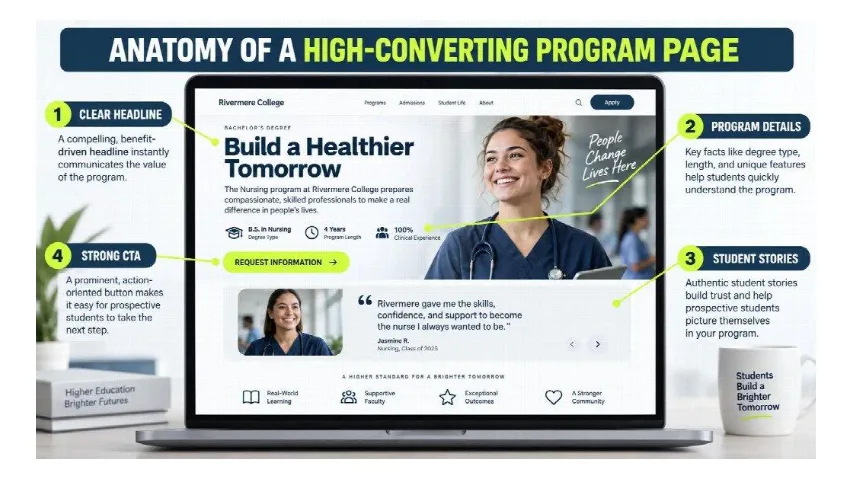
Every major program should have a dedicated, optimized page covering:
- Program overview
- Skills students may develop
- Curriculum or course topics
- Program length and schedule
- Learning format
- Admission requirements
- Tuition and financial aid information
- Career paths
- Frequently asked questions
- The next enrollment step
Dedicated program pages allow institutions to target specific searches such as “medical assistant program,” “online business degree,” “HVAC training near me,” or “evening nursing classes.”
They also give prospective students enough information to compare options without repeatedly contacting the admissions department for basic details.
Creating this structure requires more than an attractive visual theme. Specialized Education Website Design Services can connect program architecture, student-focused UX, technical performance, SEO, and enrollment conversion within one consistent website experience.
Design Separate Journeys for Different Audiences
An education website rarely serves just one group. Its visitors may include:
- Prospective students
- Parents and family members
- Current students
- International applicants
- Adult learners
- Faculty and staff
- Alumni
- Employers and community partners
These groups may visit the same website, but they have different goals. Prospective students want to compare programs and understand outcomes. Parents may focus on safety, credibility, tuition, and support. Current students need quick access to portals, calendars, policies, and campus services.
Trying to serve every audience through the same pathway creates clutter. Instead, the website should establish clear routes for its most important users.
Audience-based navigation, contextual calls to action, program filters, and personalized content blocks can help visitors reach relevant information with fewer clicks.
Turn Program Pages Into Enrollment Pages
A program page should not read like a digital brochure. It should help a visitor make a decision.
Strong program pages usually follow the natural progression of a prospective student’s questions:
- Is this program relevant to my career goals?
- What will I learn?
- How long will it take?
- Can the schedule fit my life?
- Is the institution credible?
- What support will I receive?
- What should I do next?
This order matters. Asking visitors to complete a long application before they understand the program creates unnecessary friction.
Instead, institutions can use smaller conversion points throughout the page. Someone at the beginning of the decision process may download a program guide. A more interested visitor may request information, schedule a tour, or speak with an admissions representative. A highly motivated prospect may be ready to apply.
A high-converting education website supports each of these readiness levels.
Use Real Stories to Build Trust
Education is a major personal and financial decision. Visitors need more than polished promises before sharing their information or starting an application.
Authentic student stories are among the most effective ways to make an institution’s value feel tangible. Instead of using generic testimonials, show the context behind each experience:
- Why the student selected the program
- What challenges they faced before enrolling
- What they valued about the learning experience
- Which skills or confidence they gained
- What they pursued after completing the program
Real campus photography, classroom environments, laboratories, instructors, and student activities can also strengthen credibility. Generic stock images may make a website look polished, but they rarely show what attending the institution actually feels like.
Trust signals should be placed close to important decisions. Accreditation details, employer relationships, graduate outcomes, student support services, and financial aid information are especially useful near inquiry forms and application calls to action.
Make Tuition and Admission Information Easy to Understand
Hiding essential information does not necessarily generate more leads. In many cases, it simply creates frustration.
A prospective student may not need an exact personalized tuition calculation on the first visit, but they should be able to understand:
- Which expenses are involved
- Whether financial aid is available to those who qualify
- How to request detailed tuition information
- Which documents are required
- When applications close
- When the next classes begin
- What happens after submitting an inquiry
Clear expectations reduce uncertainty. They can also improve lead quality because people who contact admissions have a better understanding of the program and enrollment process.
Keep Inquiry Forms Short and Relevant
Every additional form field asks visitors to invest more time and disclose more information. If the form feels disproportionate to the offer, visitors may abandon it.
An initial inquiry form often needs only:
- First and last name
- Email address
- Phone number
- Program of interest
- Preferred campus or learning format
Additional information can be collected later by the admissions team. If more fields are truly necessary, a multi-step form can make the process feel easier by grouping related questions.
Forms should also explain what happens next. A short message such as “An admissions representative will contact you within one business day” gives the visitor a clear expectation and makes the interaction feel more trustworthy.
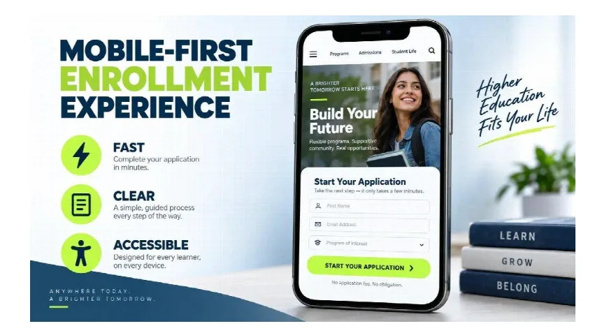
Prioritize Mobile-First Education Website Design
Many prospective students discover schools while using their phones. They may be commuting, working, comparing programs during a break, or discussing options with family members.
A mobile-friendly education website should offer more than a layout that technically fits a smaller screen. It should make every important action easy to complete with one hand.
That means:
- Readable text without zooming
- Large, clearly labeled buttons
- Short forms with appropriate mobile keyboards
- Compressed images and fast-loading pages
- Simple menus
- Click-to-call contact information
- Sticky but unobtrusive calls to action
- Program information broken into scannable sections
Mobile speed is especially important for paid campaigns. Every click has a cost, and a slow or unstable page can waste that investment before visitors even see the offer.
Build Accessibility Into the Design
Accessibility should be treated as a foundation of the website rather than a feature added at the end.
An accessible education website benefits students with visual, hearing, motor, or cognitive disabilities, while also improving usability for the broader audience.
Important considerations include:
- Sufficient color contrast
- Descriptive alternative text for meaningful images
- Keyboard-accessible navigation
- Clear heading hierarchy
- Visible focus indicators
- Captions and transcripts for video content
- Descriptive link labels
- Form fields with clear instructions and error messages
Accessibility decisions should continue after launch because newly added pages, PDFs, videos, and forms can introduce problems over time.
Use SEO to Reach Students During Research
Search engine optimization helps an institution appear when prospective students are actively researching programs and educational options.
Rather than targeting only broad terms such as “best college,” the content strategy should cover searches that reveal specific intent:
- Career training programs near me
- Evening classes for working adults
- How long does a medical assistant program take?
- Online certificate programs
- College financial aid options
- Trade school programs
- How to apply to college
- Best programs for a career change
Program pages should target commercial and enrollment-focused searches, while blog articles and guides can answer earlier research questions.
Effective education SEO also depends on technical fundamentals, including page speed, mobile usability, internal links, crawlable program pages, descriptive title tags, structured data, and consistent location information.
Connect Marketing Campaigns to Relevant Pages
A common conversion mistake is directing every advertisement, email, or social media campaign to the homepage.
Someone who clicks an ad for an evening dental assistant program should land on a page about that exact opportunity—not a homepage that forces them to begin their search again.
Message consistency should continue from the campaign to the page:
- The headline should reflect the advertisement.
- The page should focus on the promoted program or event.
- Images should match the audience and offer.
- The call to action should represent the logical next step.
- Unrelated navigation and distractions should be limited.
This alignment makes the experience feel intentional and reassures visitors that they have arrived in the right place.
Measure the Entire Enrollment Journey
Traffic alone does not show whether an education website is working.
Institutions should track meaningful actions such as:
- Program page visits
- Information requests
- Guide downloads
- Phone calls
- Campus tour bookings
- Application starts
- Completed applications
- Qualified leads
- Enrollments
It is also important to evaluate what happens after a form submission. A campaign may produce many leads but few enrollments because the traffic is poorly targeted, the offer creates incorrect expectations, or follow-up takes too long.
Connecting website analytics with admissions and CRM data provides a clearer view of which programs, campaigns, and landing pages contribute to actual enrollment.
Test the Elements That Influence Decisions
An education website should continue improving after launch. User behavior, program demand, campaign traffic, and institutional priorities change over time.
Useful A/B tests may compare:
- Outcome-focused and program-focused headlines
- Short and multi-step inquiry forms
- Student testimonials and program benefit sections
- “Request Information” and “Speak With Admissions” buttons
- Real classroom images and campus images
- Different placements of tuition or financial aid information
Tests should focus on one meaningful change at a time and be evaluated using qualified inquiries, applications, and enrollments—not clicks alone.
The best education websites do not overwhelm visitors with information. They organize information around the decisions prospective students are trying to make.
Clear program pages, focused landing pages, authentic stories, mobile performance, accessible design, and simple conversion paths can turn a school website into a more effective enrollment platform.
A visitor should never need to search for the next step. When the website anticipates their questions, reduces uncertainty, and communicates value clearly, moving from interest to inquiry feels natural.
